(1) Create Your Dashboard
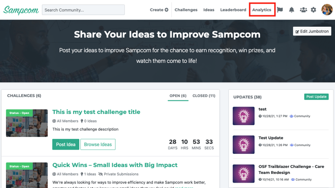
Click on 'Analytics' tab on the community navigation board
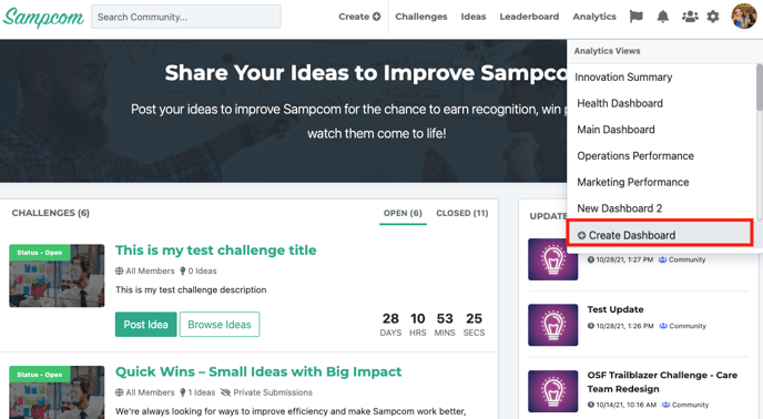
Click on the + Create Dashboard from the drop down menu
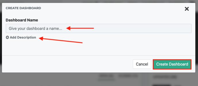
A pop-up will appear. Provide a title to your analytics page, add a description if desired and click on 'Create Dashboard' button
(2) Add Gadgets to Your Dashboard
Gadgets represent "widgets" that can display charts and other types of data in your dashboard. There are currently three types of graphs which you can utilize, each is covered below!
Add a Bubble Chart Gadget
Bubble charts help you visualize ideas based on several criteria simultaneously.
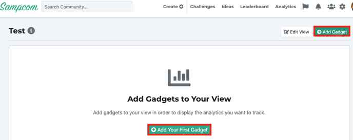
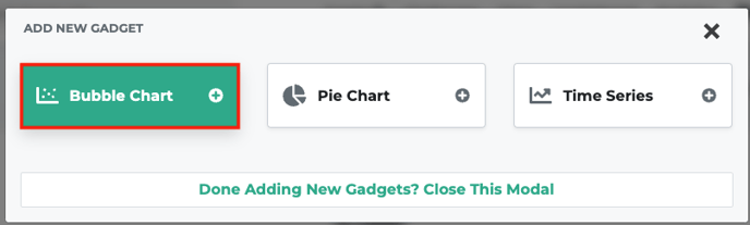
On the analytics dashboard, click on the '+ Add Gadget' button or the '+Add Your First Gadget' button on the page
Select the bubble chart gadget
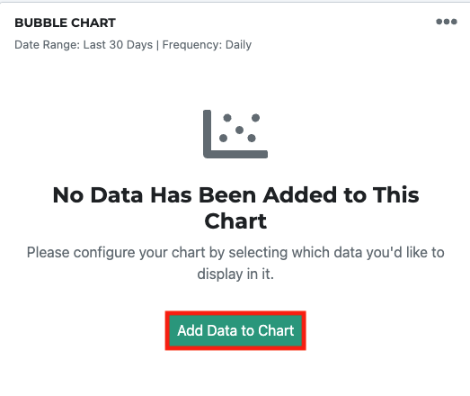
Click on the 'Add Data' Button on your Bubble Chart gadget
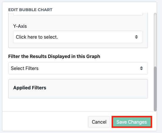
Enter in the desired information and click 'save changes' button
Add a Time Series Gadget
Track the performance of metrics like new ideas and idea status over time.
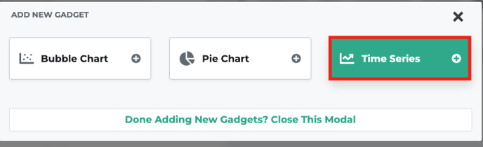
On the analytics dashboard, click on the '+ Add Gadget' button or the '+Add Your First Gadget' button on the page
Select the time series gadget
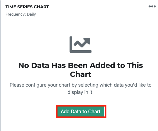
Click on the 'Add Data' Button on your time series gadget
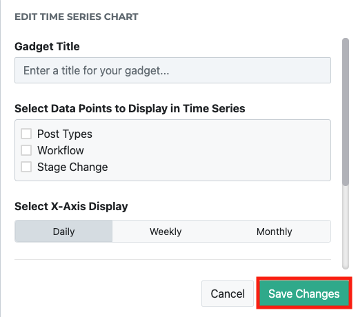
Enter in the desired information and click 'save changes' button
Add a Pie Chart Gadget
Here's how to add a new pie chart to your analytics dashboard to see a distribution of categories, sources, or anything else you'd like to graph!
On the analytics dashboard, click on the '+ Add Gadget' button or the '+Add Your First Gadget' button on the page
Select the time series gadget
Click on the 'Add Data' Button on your time series gadget
Enter in the desired information and click 'save changes' button